Thursday, April 30, 2009

Big green bottles

Image via Seed Femme

Image via Seed Femme

Image via Toast

I bought one of these big vintage glass bottles for $5 from an op shop. Actually, I spotted it. Left. Drove home. Mulled over it. Went back with JD the following weekend. He agreed it was cool. Then it was ours.
Does anyone know what they were used for?
It stands 50cm tall & 30cm in diameter and yet as most things, we have no purpose for it, but hope to find a pretty spot for it.

Have you been into the new Seed Femme stores? They recently opened stores in High St Armadale, in Melbourne & Oxford St, Sydney. If not, you should check out their website to view the beautiful instore styling. It's very beachy, Cape Cod, Hamptons-ish.
I especially love the the white timber racks, kinda like the bakers racks or shoe trolleys I've been obsessing over. Oh and the coffee table with industrial metal legs (oh my, who would have guess?)

There's lovely little vignettes everywhere, bird cages, ladders, vintage hardbacks, old glass bottles etc.. The clothing is abit meh, but definately will be dropping in again just to admire the space.

Monday, April 27, 2009

Me likey...

very much!!

And as I'm full of contradictions, on the total flip side I also like:

GREY again, yet again
Aura's new range of bedlinen

Realistically our bedroom is more option 2 - minus artfully placed vintage hard backs and replace with magazines strewn everywhere.. Funny enough, I do have one of those Ikea stainless steel Forsa work lamps on my side of the bed already..

Sunday, April 26, 2009

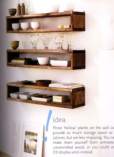
Floating timber shelves

I love the look of floating timber shelves. I might try and attempt it somewhere in our the kitchen or entrance way..

Scanned from Ideas for Living by Ali Hanan

Image source unknown

Scanned from Inside Out Magazine

Scanned from Vogue Living Magazine

Saturday, April 25, 2009

Faded florals


Image scanned from Vogue Living Magazine

Image scanned from Inside Out Magazine

I love small hints of faded floral prints around the house. I have some faded vintage Sanderson cushions on my couch. Yes, I'm style confused and torn.. I love the rustic industrial look but then I like the whimsical faded florals and vintage whites but then I love the retro quirky look and occasionally I like clean modern lines. Hopefully it all comes together and looks ok.

Christy Turlington was my sisters favorite super model back in the early 90's, mine was Helena Christensen. I'd love to see what her New York fashion and homewares store, Butik (Danish word for speciality store) is like. She opened it back in 2005 with friend Lief Sigersen but unfortunately I can't find a website or images online.

Thursday, April 23, 2009

Missed out

Oh man, devasted that I missed out on these babies on ebay! In the dying minutes my internet froze! Arrggh!

I know they look like elfish clogs but I love them! Oh man, they would have looked awesome with winter tights!


Sigh... Oh the cute buckle.. Oh the round toe and slight heel... Oh the pin hole design..
More images
here.

Tuesday, April 21, 2009

Monday, April 20, 2009

coffee table

We bought an old wooden plank from Richmond Relics (now Ridgey Didge) industrial furniture store in Melbourne 8 years ago, even before we bought our flat.
Apparently it was use as platform to assist people on and off train back in the day.. Hmmm, I never know whether to believe these stories told by second hand dealers, for all we know they could be complete bulls**t, but it is a quaint story to tell our visitors. Either way we thought it was cool and would make a great coffee table.

We considered putting big fat castor wheels on it..
But the eventual plan is to weld a metal frame to elevate it, sorta something like this:


In the meanwhile I thought I could make it work it like this..


Scanned from Simple Style By Julia Bird

But our couches are higher and leaning down that low for our cup of teas was getting annoying...

Luckily we've befriended a welder who is a has offered to help. By posting about it will now bring an onslaught of nagging JD and our poor friend. Hopefully a pic of the finished table won't be too far away!

Sunday, April 19, 2009

Apparently Dulux White on White is not so White..

no, it's more grey.


So I finally got round to painting the bedroom today. And after finishing the first coat I've decided its a little too grey for my liking (yes, even though I'm going through a grey phase) so I'm going back to the hardware store to buy a couple more sample pots. Serves me right for being a smart ass and thinking I'd get it right in the first go.
So I'm now thinking it will need to be either Natural White or go back with the British Paints Base White that I used for the lounge room.

New but old lights


I am rather miffed about the lack of attractive and affordable lighting retailers in Melbourne. I have been on the look out for new pendant and wall lights/scones, but the only options we seem to have are Ikea, Beacon Lighting and Freedom. The wall lights options are especially tragic. I have now resorted to ebay and second hand finds.
This weekend I finally had our lounge room pendant hung which was an ebay score for $40 - the old couple said they bought it in the early 80's and had it in stored in their shed ever since.
The before fitting was a shabby chic (more shabby, than chic) candelabra, complete with faux plastic candle wax dripping on light bulb fitting. The wall lights are the same design, so I need to find something that suits the one above quick smart.

Saturday, April 18, 2009

What to do? To paint or not to paint?

So here's the dresser I had been eying off at the local op-shop nearby work. On my super successful day of op-shopping I decided for only $50 it surely had to be mine. The several elderly gentlemen at this particular Salvo's were super cute and ridiculously helpful in carrying it into my already jam packed car.

Originally it had a mirror attached but I want to use it as a sideboard so I unscrewed it off quite easily and gave it to my sister, which she was wrapped about.

I'm now debating as to whether I should leave it as is, or paint it a very light gray which is what I had originally intended to do.. I've been a bit of a fence sitter on the debated comments on painting furniture on Design Sponge so it doesn't surprise me that I am umming & ahhing over this.

It does have some minor white heat marks on the top but that doesn't overly phase me. It's more so that it's a very warm orangey colour..

Our home is full of mix mosh furniture and as they say maybe it "just comes together", then again I am trying to make an asserted effort to cull and make our home more "polished" and not so "looked what I dragged in today" which is JD's sentiments occasionally.

Hmm, any suggestions?


Here's the lovely wooden letters I got off ebay (shipped from the US) a few of years ago. The letter "d" is of sentiment as it is our surname initial but the others I just liked and got a wee abit carried away and just had to have them.

Thursday, April 16, 2009

Louise Cuckow

As mentioned here's the quirky and sweet home of Louise Cuckow of Sweet Pea

Click images for larger view


Images via Russh Magazine

I especially like how Louise has made use of the white drafting drawer as a bench seat. I love them. JD & I have always wanted one but have never been able to justify the space for one.

Tuesday, April 14, 2009

Sweet Pea

I came across the sweet and quirky home of Louise Cuckow in Russh Magazine. Her home is filled with her fabulous creations, collectables, mid century furniture and glossy black floorboards. (I'll be posting on it again shortly once I get the scanner working)
Louise is a graphic designer, Karen Walker collaborator and creator of handcrafted accessories range, Sweet Pea - My oh my are they sweet!


I lurve this chair


For more news on Sweet Pea click here

Wednesday, April 8, 2009

Wintery greys

I'm loving all things grey at the moment.. Especially inky charcoals and grey marle, must be the early onset of winter.

Grey with mossy coloured greens

I want this crochet bedcover
Images via Oliver Heath's Book - Urban Eco Chic

Tuesday, April 7, 2009

Monday, April 6, 2009

Siglo Rooftop Bar

Image Via The Age

This is a cool rooftop bar called Siglo in Melbourne's CBD.
Friends and I went there for pre-drinks before a gig one night and although it was bucketing down with rain, the view of the leafy trees down below, Parliament house over the road, the old painted brick signage gave us a beautiful glimpse of old Melbourne town.


For a tour of more old signage around Melbourne check out
Our Fading Past found via Far Out Brussel Sprout.

Sunday, April 5, 2009

Promises, promises...

I promise I will:
  • Go to the hardware store and buy paint for the bedroom
  • Avoid temptation and not go to the Camberwell Market even though it's day light savings and I could get my mitts on the good stuff
  • Not procrastinate by reading the paper, blogs or flicking through magazines
  • Make time to go over to mum's for lunch
  • Make banana bread with the blacken bananas sitting sadly in the fruit bowl
  • Stop mesmerizing at James Brown in all his jumpsuit gloriness on ABC2 tv
  • Not forget the tickets as we leave the house to see Arj Barker tonight at the Melbourne International Comedy Festival

Saturday, April 4, 2009

Confessions of a op-shoppaholic

Ever squealed silently (or out loud) as you've just uncovered an absolute op-shop gem?

What a dream.. just in time for winter, perfect with ribbed tights!!

This is an oldie - all the way from St Vinnies in Wangaratta

Or bought something (even though it's not your exact style) but you just couldn't bare to leave it behind because:

a) some one you know would definitely dig it?

A beautiful mustard colour with a stunning golden bronze shimmer

b) because of its absolutely stunning embroidery detail... Even though it's only 1 curtain and not quite wide enough to fit your window?

For $7.50 who would complain??

c) because it's vintage Bally for $5!!


BUT ALTERNATIVELY, you may:

a) Have it hanging around for a year only to:
b) Assume someone would pay squillions for it on ebay and delude yourself that you could make a good profit
c) But then no one does, and you're a doofus and ya can't even give it away for free!
d) End up giving it back to charity
e) Ask yourself what on earth was I thinking?? And think oh well, at least the money has gone to a good cause.
f) All of the above

With some luck you may cherish it for years, use it constantly, adore wearing it, or smile proudly as walk you past it it your home.

PS Ummm, I was suppose to be on my way to buy paint from the hardware store for our bedroom. As you can see I got a tad side tracked... Oh well, try again tomorrow (ha, op-shops don't open on Sundays)

Friday, April 3, 2009

My bathroom tiles are kinda cool..


It took a bit of time to appreciate them but they've definitely grown on me...
Of course, the Barbie pink basin, bath tub and shower tiles are still hideous but after reading Door Sixteen's bathroom renovations I'm so inspired.Font size

Abit of Morocco in our bathroom..?

Images from Inside Out Magazine

So there's seriously 3 different wall tile colours; barbie pink, white & dark blue.. As you can imagine this goes beautifully with the 3 shades of grey on the floor.. Geeze, what were they thinking? When we rip them out, I'm definitely using simple white subway tiles. I'm obsessed with them.

We bought our flat 7 years ago, when I was 20 & JD was 22 years old. Golly gosh time has flown!!
There have been some minor cosmetic changes, but overall we've been rather slack. When I think of all the interior phases I been through, I am some what relieved we didn't.

Although I still adore the rustic shabby chic style, I now have the sense that this look would look odd in our 1950's blonde brick flat. I'll save that for our country getaway "and/or" our beachside weekender.... Hmm, a girl can dream.

Thursday, April 2, 2009

This is the lovely home of textiles designer Daniella Moore. I've been meaning to take the drive to visit her homewares store Tree in Flinders.


Images from The Age: Melbourne Magazine